Hello there! I've been wanting to play in my art journal more in search of my own style, my own creative voice as "they" say but I was in desperate need of inspiration so while shopping at the local fabric store, I purchased a few different awesome Stampington & Company magazines: Art Journaling and Somerset Studio. Just what I needed to get my mojo jump started!
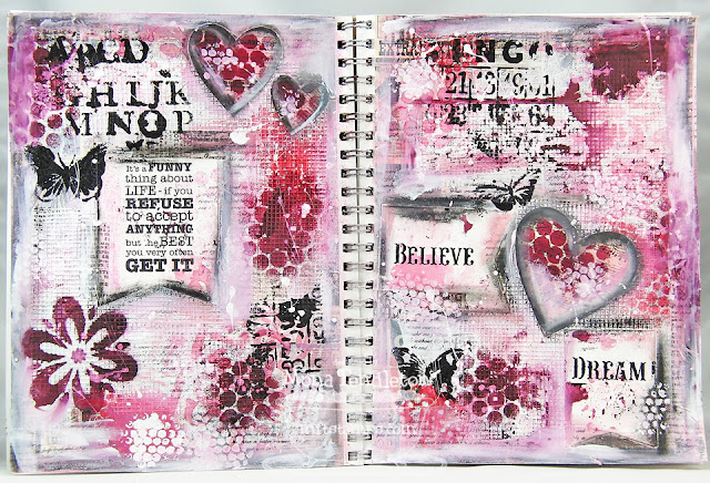
I tackled creating a two page spread in my larger size art journal that measures 9" x 12". This is what I came up with:
I wasn't happy with all the black so I pulled my supplies back out and white washed away some of the black shading then doodled here and there. I find the softer lines easier on the eyes ~ which version do you like?
To create these art journal pages, I combined various MFT stamps, Die-namics dies, stencils, paints and inks.
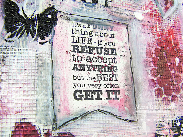
I stamped a sentiment from Die-namics Vertical Greetings 11 Die & Stamp Set on a die cut made using a Die-namics Jumbo Fishtail Banner STAX die.
All the die cut hearts were made using various sized Die-namics Heart STAX dies.
Page 2:
Another die cut heart made using a Die-namics Heart STAX die:
I stenciled the words DREAM and BELIEVE on die cuts made using Die-namics Jumbo Fishtail Banner STAX dies:
I randomly stamped text using a stamp from Die-namics First Class Friend Stamp Set Set.
For color inspiration, I joined along with The Play Date Cafe:
Thanks so much for visiting ~ I hope I've inspired you to create!Be Sweet ;)


47 Sweet Comments So Far:
Oh my heavens! This is GORGEOUS Mona : ) It's always so great to have you play with us over in The Cafe!
They are both gorgeous but since I like contrast, especially pink and black, I lean more towards the bolder one. ~Diane
Fabulous journal pages. While I know you like the softer look, I think that the black defines some of the images and makes them stand out from the other things on the page. Both look amazing though, lots of great detail on both pages. :)
Wow, this is so incredibly beautiful, Mona! Love all the texture and colors! Both really show off what a talented person can be done with mixed media! TFS!
Gorgeous journal page! I love all the textures and patterns! Thanks for joining us this week at The Play Date Cafe.
This is exquisite, Mona!! I don't see a huge difference between the original and the softened version (don't know if it just isn't showing up well on my screen), so I love them both! What's the netting material you used, I love the texture it adds to the pages?
Yes, I have a smile on my face!! Love both versions...sentiments, colors, stencils, paint....love it all!
Absolutely stunning work of art, Mona! Love all your beautiful techniques!! I think both of these turned out perfect! TFS!
Well they're both beautiful Mona, it's hard to pick between the two! The second is softer and kind of dreamy, but the black adds some pop to the first! Hmmm can't decide, love them both ;)
Mona, what gorgeous journal pages!!! I love your colors and the beautiful and varied textures! Really shows off these techniques so gorgeously!
Wow, Mona, both of these pages look amazing! I personally like the black rather that gray highlighting. Makes your art stand out more; just my opinion. Love them both though! You are just so darn talented!
Great job, Mona! Either version is beautiful! Love them both!
Красиво и очень! Как будто на снегу выросли цветы и полетели бабочки, весной веет от ваших страничек.
Wow!! Fantastic!!! Love all the layers))))
Mona, I love your latest art journal pages. Both a magnificent and I have to side with the darker lines on the first. You really worked some amazing magic on these pages! The textures you created and these colors are so beautiful! Thanks so much for sharing with us!
Looks like you really enjoyed this project ... fabulous work!
Beautiful art pages Mona!! Hard to say which I like the best, the bolder one stands out more but the softer on has a bit more of a ethereal look!
Wow! This is absolutely fabulous!!!!!!! Love what you've done for the challenge! Beautiful!
Wowww loving these gorgeous pages Mona... how could I not with all that fab pink?
Hugs
Christine x
OMG, these pages are magnificent! So beautiful!
Awesome mixed media pages! I would love to learn how to create such beautiful pages like this! TFS!
Love the vibrant colors on your art journal!
Just gorgeous!! I love both versions, but I think the darker one is my favorite. It makes the artwork really pop and stand out. Everything you make is like a work of art!
Really beautiful pages! Definitely the darker lines are more appealing and make your beautiful work stand out more! Thanks for sharing your talent with us!
Absolutely gorgeous art journal pages! I cannot decide which versions I like best! Both are amazing!
Wonderful art journal pages, Mona! Love both versions - the black is definitely more bold while the white washing tones it all down - too hard to pick a favorite!
Wow, Mona, you are such a talented designer! LOVE your pages! Either way they are gorgeous!
Absolutely breathtaking pages, Mona! I LOVE the gorgeous netting texture and the molding paste. What a way to use these dies and stamps! This is so gorgeous! I think the lighter, softer version is my favorite although the dark lines in the first help to highlight your beautiful work. It doesn't really matter; whatever you do is always amazing! I'm a big fan! TFS!
Mona, your pages are so incredible! WOW, I love your colors and these textures are out of this world beautiful! Very inspiring project! Thanks so much!
Gorgeous work Mona...I love this and really love both versions for various reasons! I really want to try this too...but haven't got to it yet! You have inspired me! ;-) Thanks
what great pages for your journal Mona! Particularly like the texture you achieved with the mesh - I think I like the darker version better - to me it defines the different areas.
Gorgeous work, Mona! Love these pages either way! I'm just blown away by all the pretty texture and colors! Awesome!
BEAUTIFUL Mona!! I LOVE both sets!! But then again I always LOVE anything you create!!
Hope your day is GREAT!!
Magnificent pages! So creative! Wish I could create such gorgeous pages! Thanks for sharing!
Wow, what a fabulous set of pages! Love all the pretty textures and stamps used! I think the version with the darker lines is my favorite. It really makes your art stand out! TFS!
Zwei wunderbar gestaltete Journal-Seiten, Mona, die erste Version gefällt mir persönlich etwas besser.
Liebe Grüße.
I think the pages are just fabulous. I think I'm more drawn to the darker edges - I like the bolder contrast, but it's your Art Journal and that's what matters! Love the words and colours you've used!
Absolutely STUNNING! And I LOVE how you used the colors! FAB hearts and sentiments and the netting is AWESOME!
Absolutely gorgeous, pages, Mona! I think I have to agree with several others -- the darker lines make your work stand out more and thus it's my favorite! Thanks for flooring me with these incredible pages!
Beautiful designs, Mona! Love your mixed media projects! I have to say that the first set with the darker lines is my favorite. Really makes your die cuts and designs stand out more! Stunning work as usual! TFS!
Wow, Mona, what super gorgeous journal pages!!! Everything is just amazing! Love anything you do in mixed media!
Absolutely stunning design, Mona! Love the netted texture and the wonderful colour palate! This is the work of a true artist! Bravo!
I just love the textured background! What a gorgeous spread, I am so glad that you played along with us for fun this week at The Play Date Cafe!
Oh my! This is absolutely fabulous!!!! Great techniques, amazing colors! Just wow!
Your pages look amazing.. Looks like you had some fun creating them.
Oh, how pretty. Love the pink hues with the black... and all the fabulous textures...
Stunning pages!! I actually like the one with more black better. ;-) Love the texture you created here!! ~ Blessings, Tracey
http://gracescraps.blogspot.com/
Thank you so much for leaving a sweet comment!